Re-imagining the product experience for a unified interface for enterprise data.

Duration
2 months
Components
100+
Figma screens
50+
TOols
Our Impact
🚀
Accelerated client acquistion
💸
Expedited
funding
😇
Stakeholder satisfaction
🎉
Enhanced brand perception
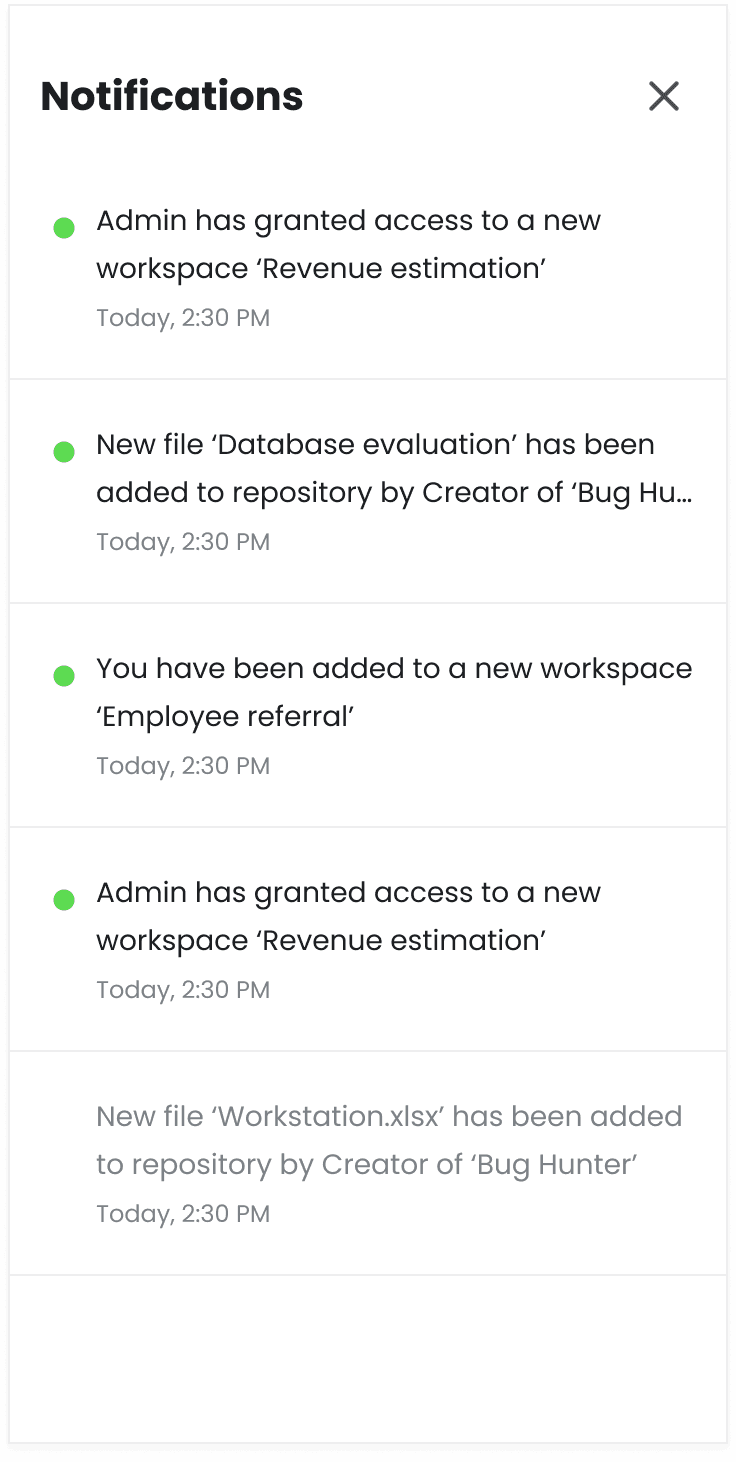
Overview
What is Datafi
DataFi is a unified interface for enterprise data that provides personalized and actionable insights from various data sources. The platform features a context-aware AI agent that learns user needs and enables easy data access, along with DataFi Studio which allows for no-code app creation. Despite offering powerful functionality, DataFi's interface needed a comprehensive redesign to align with its cutting-edge AI technology and improve user experience.

Design challenges
Outdated
The visual interface didn't reflect DataFi's position as an innovative AI technology leader
These challenges were limiting DataFi's market potential and affecting user adoption rates, despite the platform's powerful underlying technology.
Clunky
Navigation and workflows were not optimized, creating friction in the user journey

Inconsistent
Lack of a unified design system led to visual and functional inconsistencies across the platform

Overwhelming
Complex data functionality was presented in ways that could overwhelm users, particularly new ones
Our process
We first delivered a 72-hour MVP to address crucial pain points, then over 45 days we revamped the design system and interface across web, mobile, and plugin, culminating in a fully tested final design
Rapid MVP
72 hours
We kicked off the engagement with aniIntensive 72-hour sprint to develop a "Day 0 MVP"
Re-design
45 days
We maintained weekly deliverables to ensure project momentum. Regular sync-ups ensured team alignment
Support
15 days
We created design system guidelines for development team and provided full support during development phase

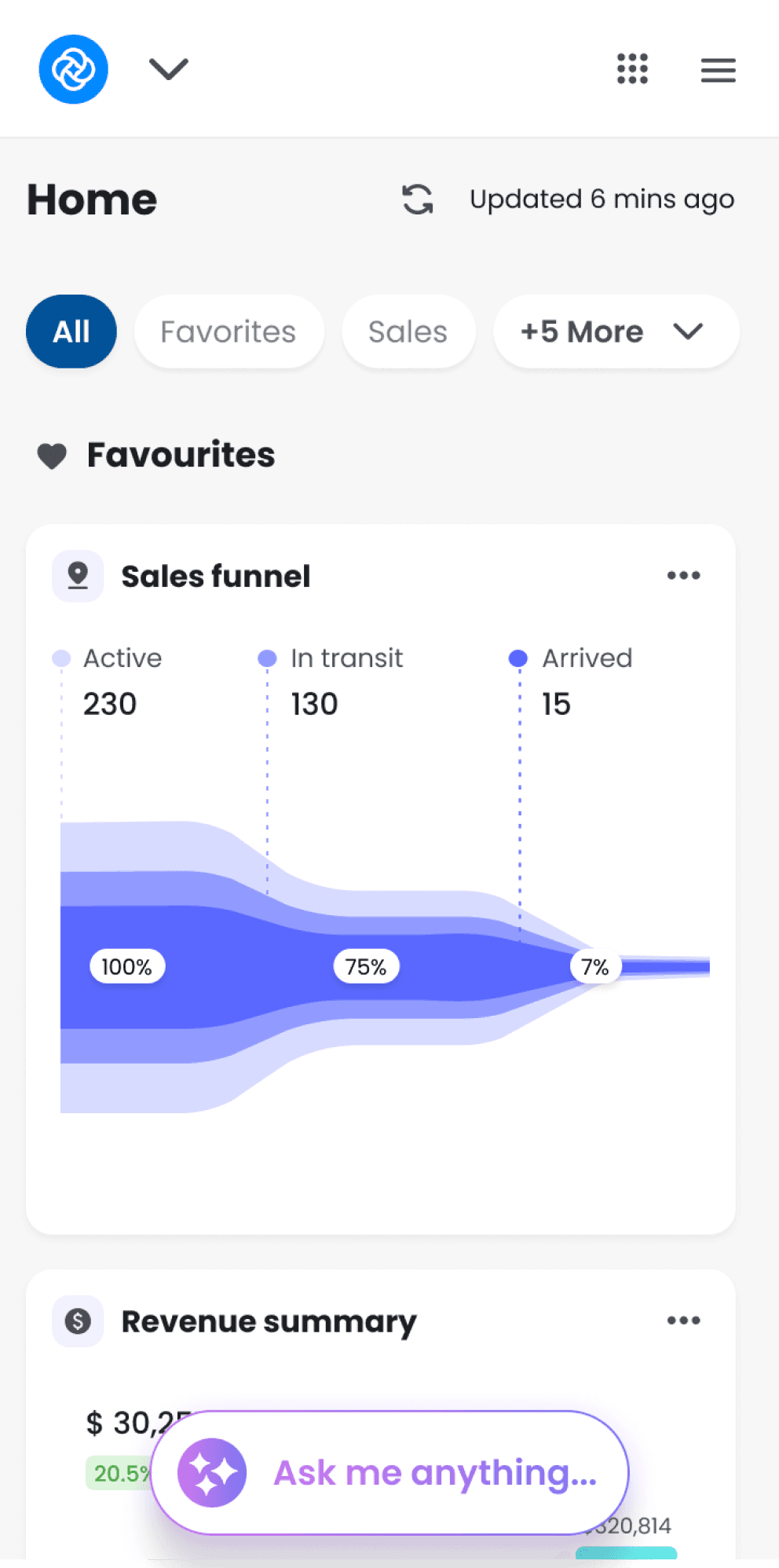
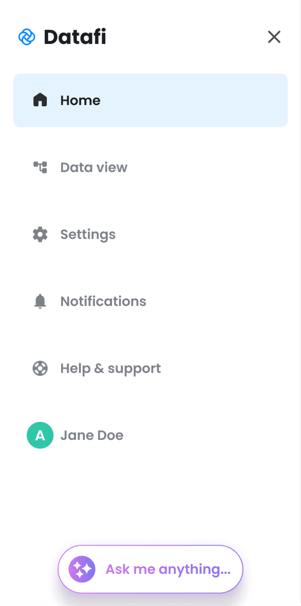
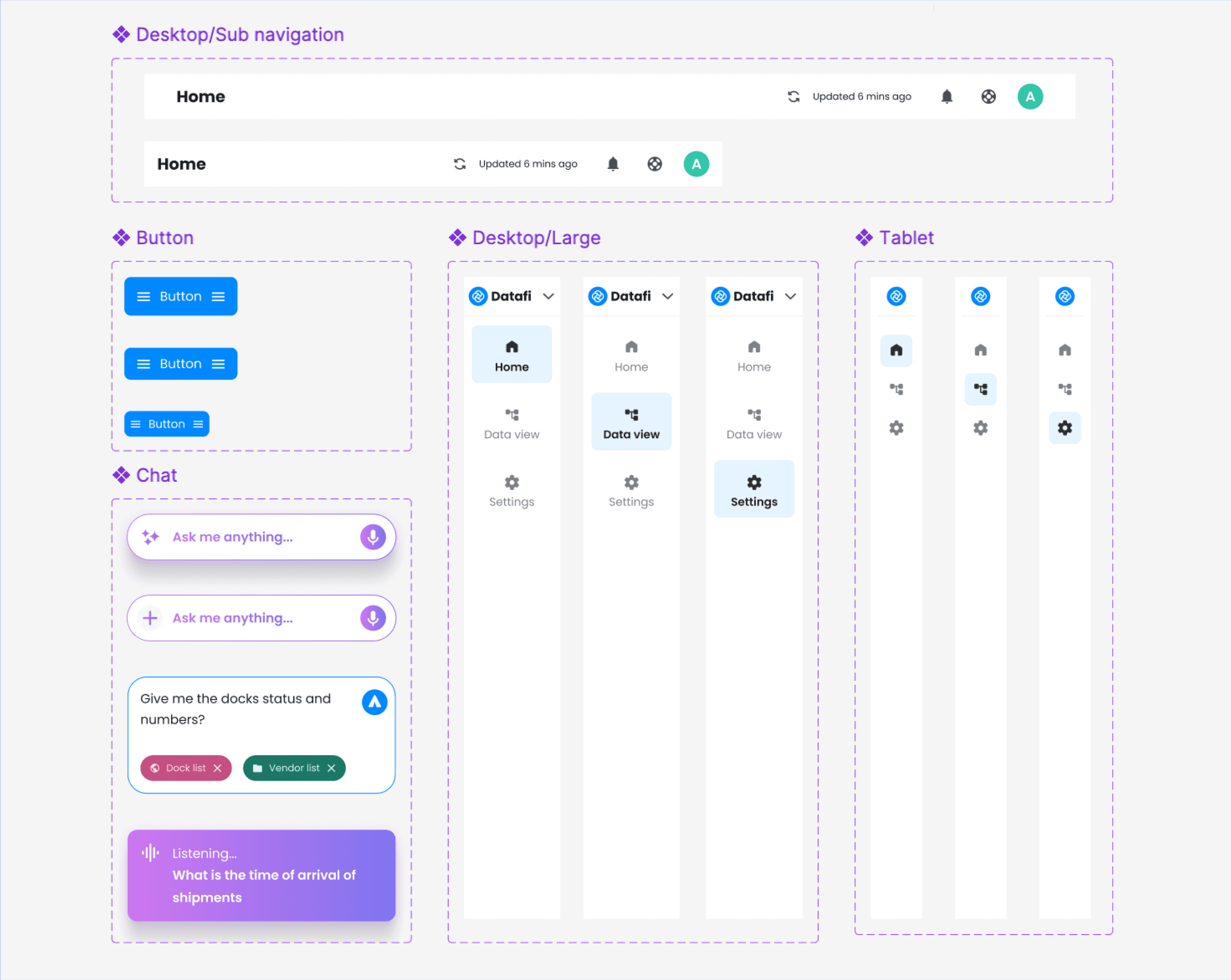
Designed for cross platform
One of the main challenges with the redesign was to come up with a modular design that could take the shape of the platform it resided in. Be it desktop, tablet, mobile or browser extensions we made sure the design works for each use case.
Desktop
Tablet

Mobile

Chrome plugin

MVP deliverables
We delivered a prototype for the MVP in just 72 hours. The deliverables covered the core problems in UX and certain flows and providing a functional prototype to showcase the UX improvements. In total we covered a range of innovations of which a glimpse is provided.
figma screens
20+
TOols
User Scenario
A repair department employee, inspecting a vehicle that arrived at the warehouse, notices an anomaly in the tire. The employee needs guidance on how to fix the issue, identify the right vendor or person to approach, and locate relevant documentation to take appropriate action.


Get a free MVP of your product in 72 hours
Enter you email and we will get in touch about your free product MVP
Collaborative brainstorming
Once we had a proper idea of what we are getting into and what the leadership actually envisioned to get out of this collaboration, we went back to the white board. We sat with the stakeholders and charted out a plan to do a complete overhaul of the consumer facing side. We noted down their current pain points in every section of the product and any new feature additions they were planning. We also discussed scalability and guided them on how a growing product needs to keep scalability in mind.

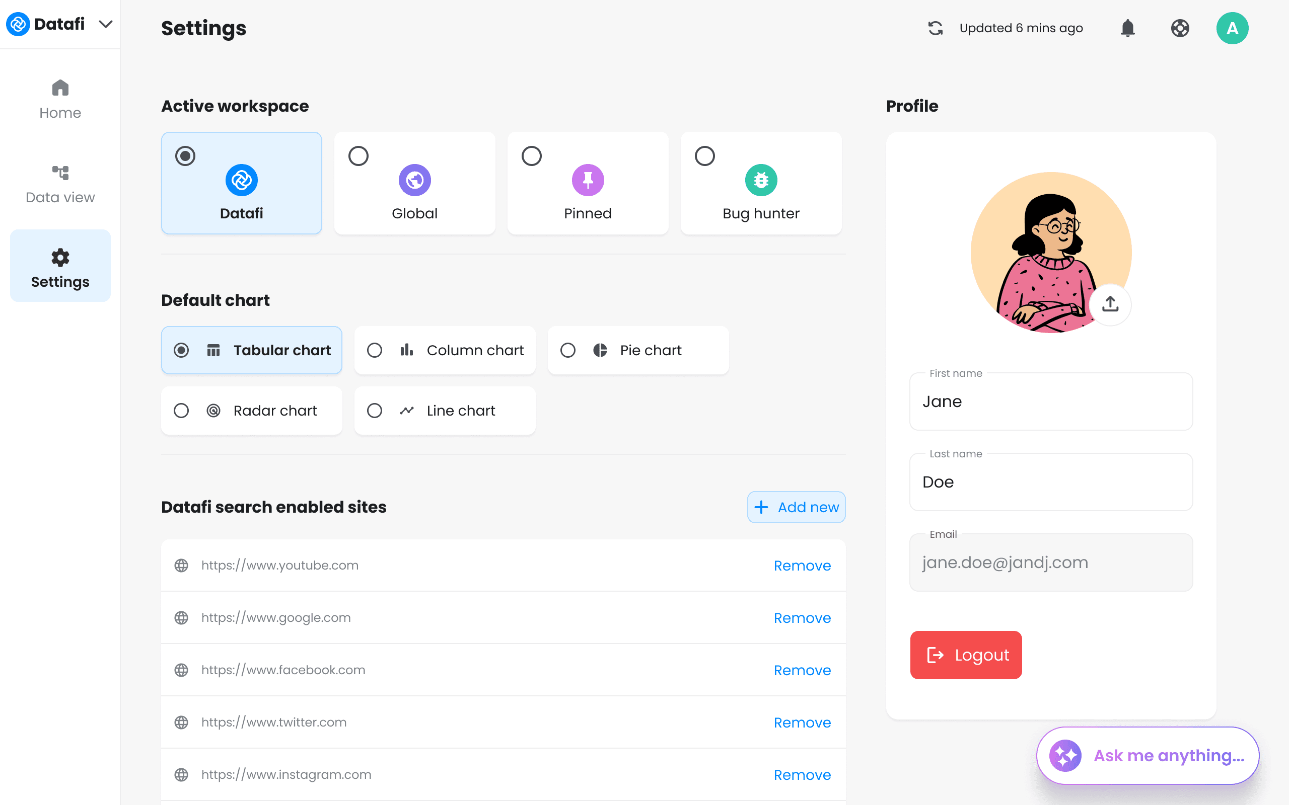
Design system
A significant part of our work involved building a design system with guidelines for color palette, typography, icons, grids, and component sizing and spacing. Over 100 components in various states and variants were created, reducing development and implementation costs, and streamlining team collaboration.
We created a variety of variants and states for common components, ensuring their easy application in any project. This comprehensive approach prevents unintended or undesirable implementations.
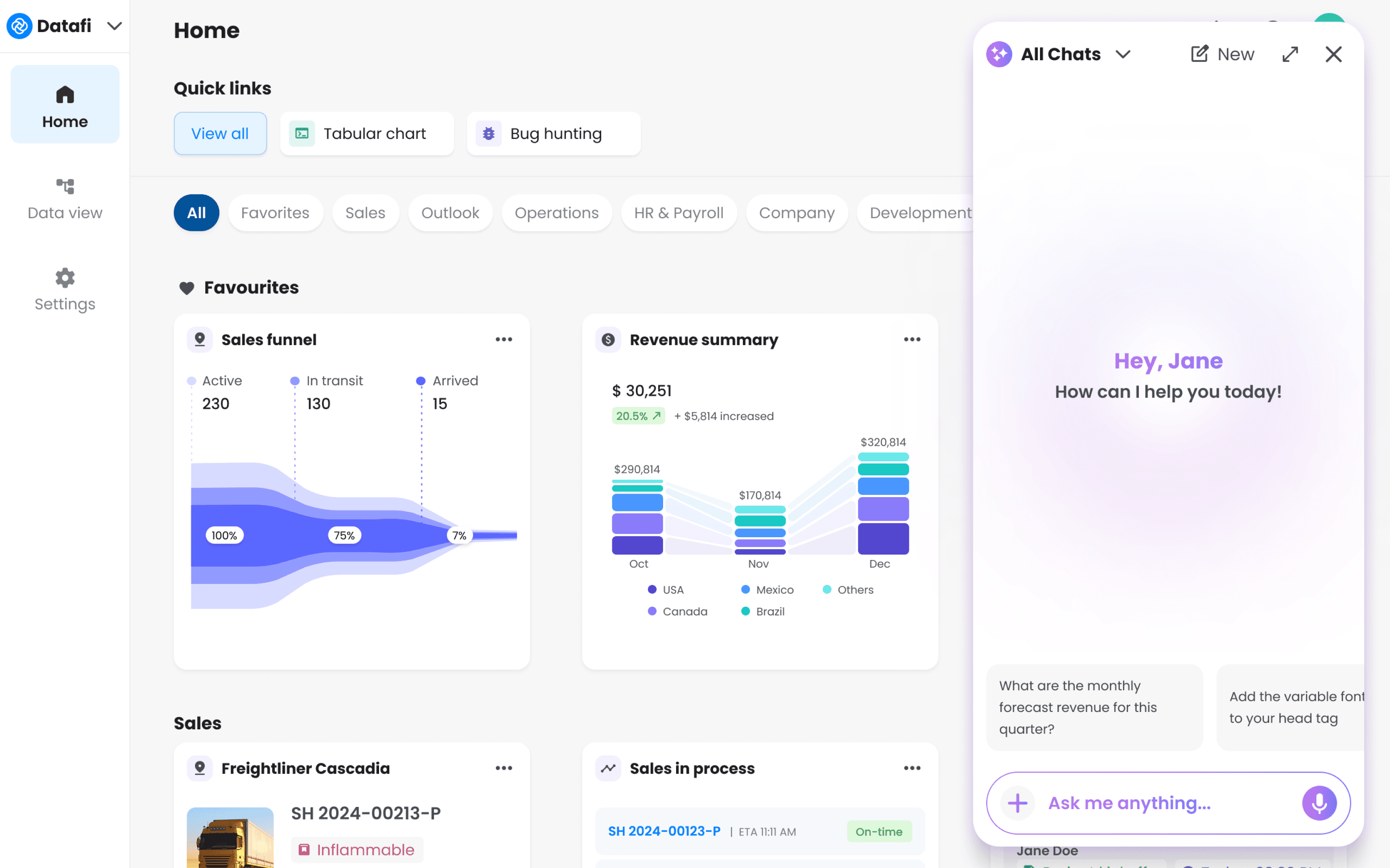
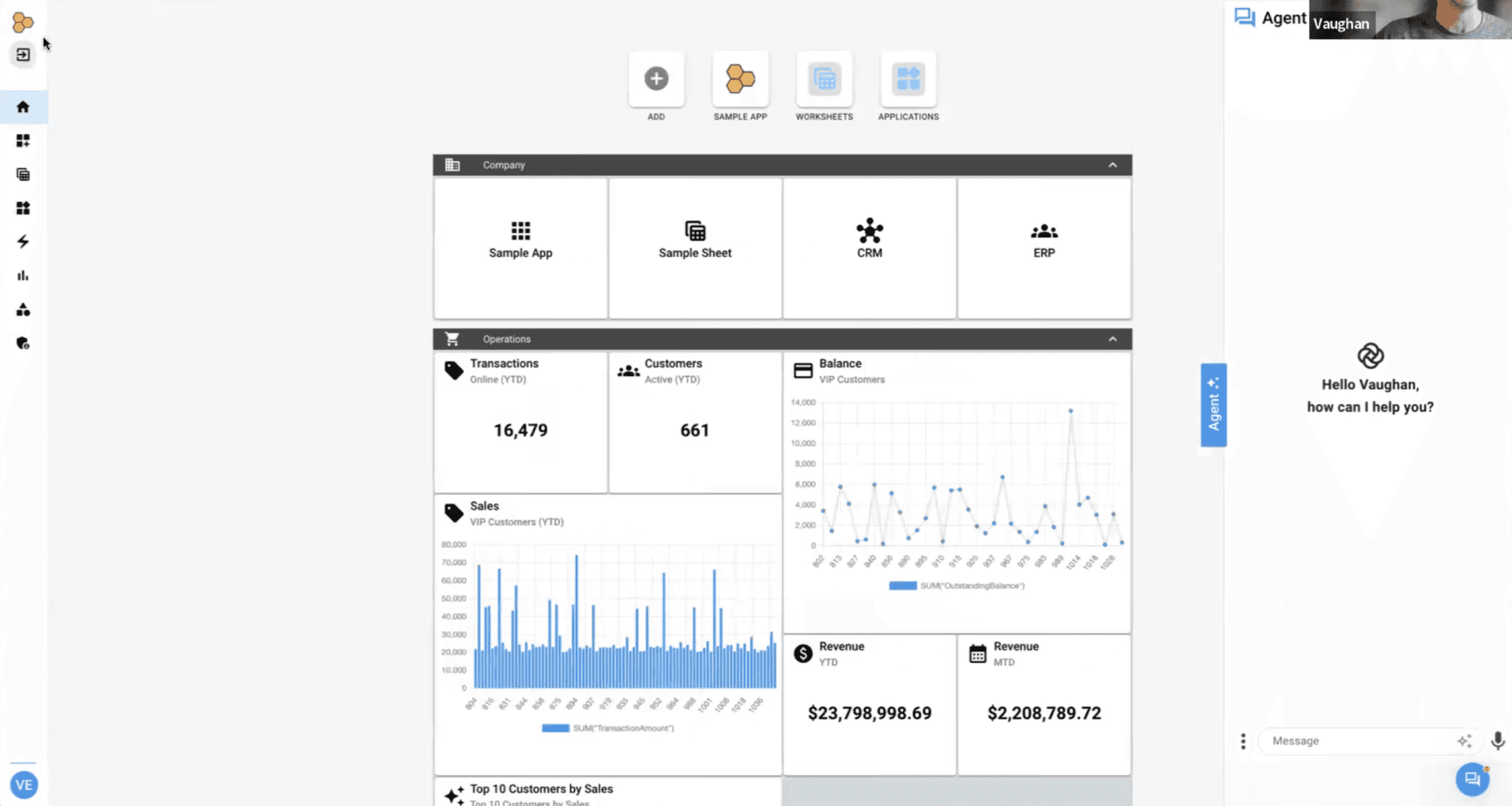
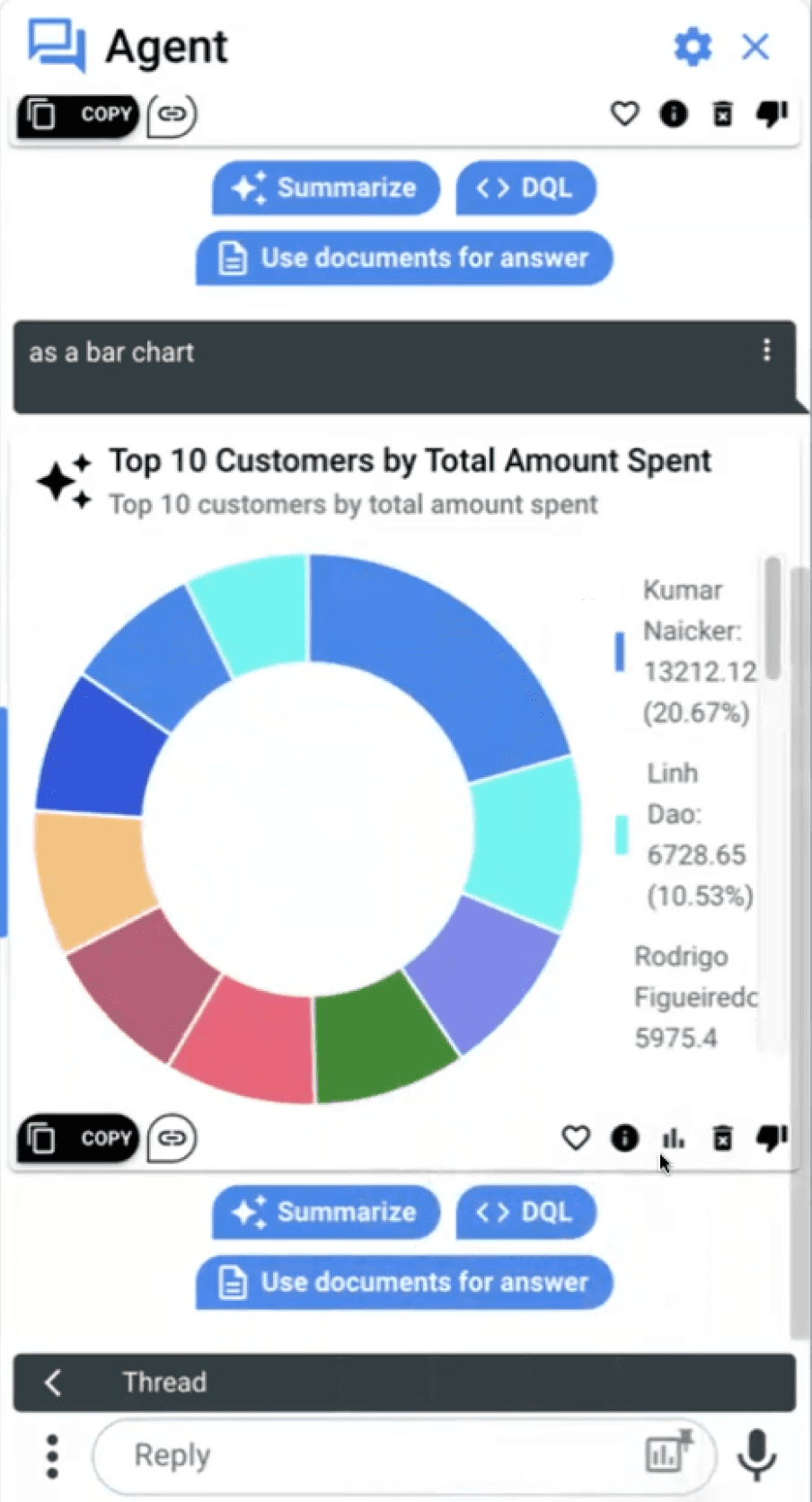
Data cards
Datafi heavily relies on data visualization and data cards to provide valuable information to the end user. The current deck of cards available were clumsy with no proper visual hierarchy and clumsy action items at the bottom. We designed pixel perfect and information legit cards for easy consumption. Also action items on card now show on hover.


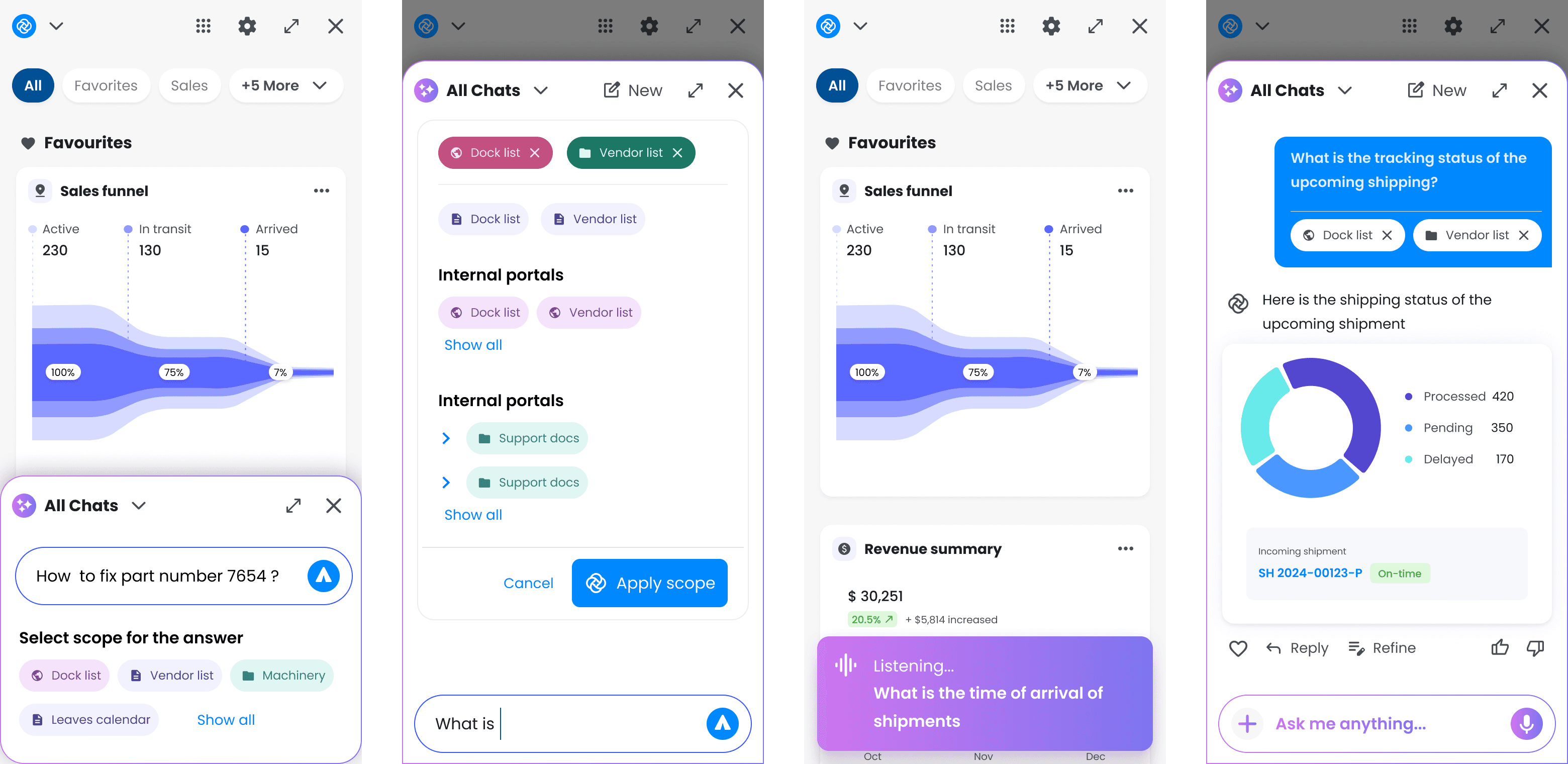
Interactive UI
All the UI features and flows were prototyped for interactivity. The leadership team at Datafi, found it a great way to visualize and provide additional design direction based on these.

Introduction of actions based on card hover in chat minimises UI clutter and makes it easy for the user to focus

Redesigned VUI

Saving a card is more obvious with introduction of micro interactions to enhance the engagement experience

Scroll based interaction for easy switching between different data card decks eliminates friction in flow